
The Visual Language of Basketball Strategy
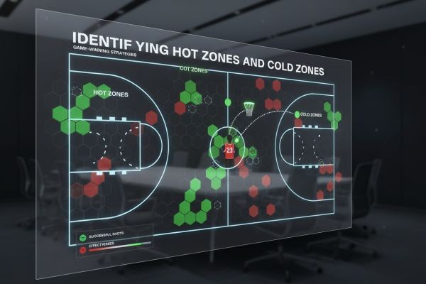
If you've watched an NBA broadcast recently, you've seen shot charts—those multicolored court diagrams showing where players attempt shots. But these visualizations represent far more than broadcast graphics; they're fundamental strategic documents that shape how modern basketball is played. Every NBA team employs analysts who scrutinize shot charts to identify efficiency opportunities and defensive vulnerabilities.
Shot charts plot attempt location and success rate, typically using color gradients or dot sizes to indicate effectiveness. A player might shoot 52% from the left corner three-pointer (an elite zone) but only 34% from above the break (inefficient). This granular data revolutionized offensive philosophy, as teams realized not all shots provide equal value, even when they're worth the same points.
The Three-Point Revolution, Explained
Shot chart analysis catalyzed basketball's three-point revolution. When analysts mapped efficiency by location, they discovered a critical insight: corner three-pointers (shorter distance due to court geometry) provided far greater point-per-shot value than long two-pointers. This revelation fundamentally altered offensive strategy.
The Houston Rockets exemplified this approach, practically eliminating mid-range shots from their offense—a strategy grounded in shot chart data showing those attempts as statistically inefficient. While controversial initially, the data proved irrefutable: corner threes and shots at the rim generate approximately 1.1-1.3 points per attempt, while long two-pointers produce just 0.8-0.9 points per attempt.
Defensive Strategy and Shot Profiles
Defensively, teams use opponent shot charts to design coverage schemes. If data shows a player shoots 45% from the right wing but 32% from the left, defenses force them left. Simple in concept, but shot charts provide the empirical evidence to justify these adjustments—and to measure whether they're working.
Coaches also analyze shot chart evolution across games. If an opponent's shot distribution changes (suddenly attempting more mid-range shots), that suggests strategic adjustment or physical/mental fatigue. This pattern recognition, enabled by shot chart analysis, allows real-time tactical adaptation.
Player Development and Evaluation
Shot charts revolutionized player development. Instead of generic "work on your shooting" feedback, coaches provide specific, data-driven guidance: "Your left corner three is already elite—let's develop your right corner consistency." This precision accelerates skill development by focusing effort on highest-impact areas.
Talent evaluation was similarly transformed. A prospect shooting 38% from three sounds impressive until shot charts reveal they're shooting exclusively from corners (easier). Another player shoots 35% overall but demonstrates balanced proficiency across all three-point zones—far more valuable, despite the lower percentage. Shot charts provide context traditional statistics obscure.
The Next Frontier
Emerging analytics overlay defensive pressure data onto shot charts, distinguishing between open shots (which should convert at high rates) and contested attempts (where lower percentages are acceptable). This context reveals true shooting efficiency—whether players create quality looks or succeed despite poor shot selection.
Some teams now generate predictive shot charts using machine learning, estimating success probability for attempts from any court location based on defender proximity, time remaining on shot clock, and player fatigue. This transforms shot charts from descriptive (what happened) to prescriptive (what should happen)—the next evolution in basketball's analytical revolution.
Details here: https://esdojo.es


